In my first few draft designs my contents page design was very structured and organised into sections like this NME Arctic Monkeys edition:
NME:
My version:
After re-evaluating my contents page I decided that my contents page looked too plain and boring to fit in with the quirky cover photograph. I looked at Katie Ford's magazine (a peer student) contents page for her AS coursework, which looks like this:
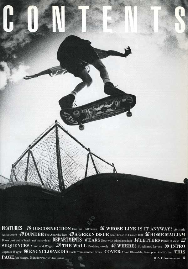
I looked around for other contents pages similar to this and found R.A.D's contents page, exceptionally similar:
I like this design a lot and will try to recreate it; other magazine contents pages that I have found inspiration in are:
Both of these contents pages have very simple colour schemes, the colours are all dull which attracts attention equally to the image and text on the page. The Kanye West 'V' magazine has a very small font for the actual contents list of the page, this is effective as it makes the contents more than just a navigation page. The Dazed and Confused contents page looks unorganised to me but the use of a simplistic image inspires me to find an equally vacant image for my contents page.


No comments:
Post a Comment