Tuesday 28 February 2012

Second Draft: Front Cover


This is my new version of my front cover. I have taken into account all of the feedback and advice Mr Smith has given me and developed a similar but improved version of my original magazine cover.
I have changed the font of the title; the wording of the cover features; and I have re-edited the image of Georgia. I have also included Georgia's name on the front cover to state obviously who she is.

First Draft: Contents Page


This is my first draft contents page. I have taken inspiration from the NME magazine interview, but I have incorporated the same theme from my front cover so that my pages show continuity. I have used the same fonts from my cover page from the magazine title; scribbled font; as well as using the same font from the date and issue.
The three photographs were all taken by myself, I have created three acts: Georgia, Will Campbell, and Cruelty. Georgia is the main featured act who is also featured on the front cover. Will Campbell, and Cruelty are both fictional 'up and coming' artists that I have formed specifically for my magazine.

I will discuss this draft with Mr Smith and write up any feedback I am given. At the minute I am unsure of whether my contents page looks too casual, and whether the lists should be boxed or left as they are. 

Monday 27 February 2012

Audience Profile:


Name: Katie Ford
Age: 17
Occupation: Full Time A-level student

Katie is a huge music fan, she's always ahead of the game when it comes to knowing who the new up and coming artists are. However she is also the world's biggest Strokes fan, and also Julian Casablancas' solo career. It is important for young people to listen to new and old music as it gives them a sense of where genres originate from and how music develops. Katie has the aspiration of being a professional photographer when she leaves sixth form, this means photography plays a big role in her life outside of school. When she gets the chance she photographs sports games, small-time gigs, and general landscapes or models; this ties in well with the world of music as both are forms of art. Katie was interested in Georgia as soon as she heard my ideas for my magazine, I then showed her the photographs I took of Georgia to receive some audience feedback and her reactions were all positive. She said "Georgia has an intriguing 'look' that makes you want to see more of her and hear her voice, especially with the animated expressions in some of the photographs".
It is important to me to receive feedback from an audience of the age range I am aiming my product at, especially from a person like Katie with a keen interest for both music, and photography.

Artist Profile:


Name: Georgia
Age: 21
Split from a group 'The Skeleton Boys'

She's changed her sound completely since splitting from the band - from indie pop, to electronic and experimental. She has a similar style to Alice Glass from Crystal Castles, and Courtney Love when she was younger; Georgia is often seen wearing leather jackets, vintage Levi shorts, knee high socks and either a high-neckline shirt or t-shirt. Her music compliments Crystal Castles style, as well as Enter Shikari (minus the male vocals). Georgia's music is most popular among teenagers and young adults, this is because it is quite upbeat and would be heard in clubs and bars in inner cities, for example, 'Mosh' in Leicester. She has a lively personality on stage, but can come across as serene and collected when being interviewed.

First Draft: Feedback

I discussed my improvements with Mr Smith today, we looked over all the aspects of my draft front cover and he advised me in which areas needed the most attention.

His overall reaction was that at a first glance the magazine is really eye-catching and is suitable for it's purpose, however the closer detail such as the existing artists featured in the magazine do not fit with the theme. I have focused on The Arctic Monkeys and The Strokes, these bands are now too 'old' and are not fresh enough to have coverage in a new music magazine; however the use of Foals and MGMT was suitable as they are still producing fairly new, up to date, music. I agreed with Mr Smith's comment about the bands being a bit out of date, it is difficult to include both classic indie with a new age indie such as Foals, mainly because the audience of Arctic Monkeys is older and may not even glance at a magazine like Fugue. I have taken this on board and looked at some other newer artists of a similar genre to my magazine, I have so far found Crystal Castles, and GroupLove.
Mr Smith said he really liked the image I have used for the front cover so I will keep that the same as I also particularly like the expression that my artist is pulling as it's unusual/quirky. He did however mention that the title now looks weak compared to the image, the font I originally chose is very thin and does not stand for itself - Mr Smith suggested either changing the font or changing the colour, or both. I had already considered changing this font as it appeared overpowered by the photograph, however I needed a second opinion so I left it as it was for my first draft; I had already looked at a few more fonts to vary my research, so I was prepared for this change.
I have focused on this font since our discussion, and I particularly like the even spacing of the characters:


A key detail on my draft front cover is that there is no title for my artist on the front cover, her name is not mentioned at all on the cover so far; this was partly because I had not decided on whether she was going to have a stage name or an original name yet. On the bright side, the t-shirt I styled her in is plain black which is ideal for me to fill the black space with her name.
The final tips were just to fill in the blank gaps, which I will successfully do in my next front cover production.

Sunday 19 February 2012

Draft: Front Cover


This is my first draft idea for the front cover of my magazine, I have researched magazines that I like and combined them together to create this draft cover. I used one of the mug shot photos I had taken of my artist as I thought it worked well as a striking image style. I have taken inspiration from the Esquire magazine with Blake Lively on the front cover, they have used a scribbled hand-written style font so I have tried to create that in my own way by used a font from www.dafont.com. I have tried to follow a pattern with the layout of my front cover; in my opinion it is a backwards 'F' as there are no gaps down the right hand side, and two gaps evenly spaced on the left hand side. I have used a very simple colour scheme of black, white, and blonde hair; this is because I feel that simplistic magazine covers stand out more in shops as most music magazines have brighter colours on them with special offers etc.

Saturday 18 February 2012

What I have learnt from my research

From researching various existing magazines I have settled on my draft ideas for my three pages. From the style I have chosen to stick with 'indie-alternative-rock-pop', I hope that my magazine could sit alongside Dazed & Confused, NME, and The Rolling Stone. I have taken inspiration from numerous existing magazines from music magazines to fashion magazines to men's magazines; this shows just how broad magazines look and how music magazines do not have to have instruments or a stage on them to show that they belong in the music category.

I have shown images of particularly inspiring magazine covers in other posts, but these are a few which translate particularly well to my design ideas:


Friday 17 February 2012

Feedback from pitch


I asked 3 fellow media students to comment on my post of my 25 Word Pitch:

Katie Ford:
Can tell really well that your genre is indie/alternative by the fashion and style chosen!

Meg Rhodes:
I like the choice of bands/ artists you've used because they all clearly belong to a similar genre. As well as this, the images you've used for fashion really help to make it clear who your target market is.

Harry Tibbles:
After seeing this it is clear what style you are going for including the music genre and Im looking forward to seeing your final project because I think its going to be great.


The responses from my pitch are exactly what I was hoping for which is good in terms of having a basis of an idea for my magazine. As the 3 comments all state that it is clear of the style of magazine, this should help me to attract the correct target audience as I can stick with my chosen genre and develop it.
The three people I asked to comment range between the ages of 17-18, this is ideal as they represent the student section of my target audience.

Friday 10 February 2012

Magazine Name

From my previous post about choosing a magazine name, I have narrowed them down to my two favourites from the list; Fugue, and Numb.
I have used www.dafont.com to produce these two names in different fonts as an experimental post:


In my opinion, Fugue sounds more like a music magazine name as I have taken it from a Foal's song on their album Total Life Forever. Also the two web definitions I found:


  • A contrapuntal composition in which a short melody or phrase (the subject) is introduced by one part and successively taken up by others and developed by interweaving the parts
    • A state or period of loss of awareness of one's identity, often coupled with flight from one's usual environment, associated with certain forms of hysteria and epilepsy


    • Thursday 9 February 2012

      Ideas for a Magazine Name


      Most music magazines do not particularly have magazine names that relate to music itself; for example NME may stand for 'New Musical Express' but not many people refer to it as that, most just stick to NME. Q magazine is also a music magazine, it was originally supposed to be named Cue, but as this is more commonly known as a snooker term, the name was changed to Q. A cue in musical terms is to prepare a record for the turntable, 'cue up a record'. 
      I have decided to look at the names of student club nights in London and Sheffield, this idea was suggested to me by one of my teachers so I researched a few on the internet:

      TigerTiger
      Vibe
      Embrace
      The Plug
      Flares

      As well as these I searched through my iTunes library for one-word song names that could be suitable for a magazine name. As my genre is indie/alternative/rock, the name has to have an edginess to it and a specific sound; for example a word with a few syllables e.g. Infinity, and Metabolism; or a short, sharp word e.g. Ghost, and Numb.

      Crystalised
      Infinity
      Reckless
      Liquorice
      Ghost
      Fugue
      Numb
      Metabolism
      Reptilia

      Wednesday 8 February 2012

      25 Word Pitch


      My 25 word pitch consists of text, photos, and a song by The Libertines called 'What Became of the Likely Lads'. 

      Sources of images:
      LookBook
      ffffound
      Esquire
      WeHeartIt

      Sunday 5 February 2012

      Dazed and Confused


      I have looked at Dazed and Confused magazine as the name I have chosen, Fugue, also ultimately means 'dazed' so I connected the two and have researched some existing Dazed and Confused magazine covers. The font used for the title of Dazed and Confused is very bold and varies in colours depending on each magazine cover and the background image.


      I have picked 6 covers that all have something in common; all of the models used are female and the shots are all mid-shot or close-up. Abstract make-up is used twice in the examples I have shown, in the 2nd and 6th images there has been face paint or over-editing on computer programmes. 
      I especially like the 6th example of Dazed and Confused, with the skeleton face. I could also recreate the skeleton face as my article is going to be based on Georgia's split from the fictional band, The Skeleton Boys.
      I also particularly like the two greyscale magazine covers, for some reason they stand out more. Magazines try to use as many colours as possible to make them stand out, the greyscale images and overall colour scheme looks effective as it is unusual on magazine products.


      Schoeller

      Martin Schoeller is a photographer of celebrities, he usually takes mugshot style photos and I have looked at some of them for inspiration for my front cover. His photographs are typically taken against a white background and are close-ups of just the celebrity's faces, here are some examples:

                                              Britney Spears                        Emma Watson

                                             Natalie Portman                      Daniel Radcliffe

                                             Katy Perry                               Pink
       
      Angelina Jolie

      I have chosen mainly girls so that I can visually compare them to my chosen fictional artist, Georgia. I have a 'mug shot' style photo of Georgia to compare to these images - although it is not against a white background, she still looks as though she is having a passport photo taken. The photos of Emma Watson and Katy Perry are my two favourite photos as they have some character in them, although they are still posing with a straight face.

      Georgia's mugshot style photos:


      I took three of her, one plain mug shot, another was unintentional as she was laughing, and the third was a 'joke' one that actually turned out well. The third image was inspired by the photograph of Pink by Martin Schoeller, as Pink is also pulling a face in her mug shot. I used a floral wallpaper background as it was easily accessible for some practise shots, I will change this to my background of choice when I am taking any final photographs.

      Friday 3 February 2012

      Alice Glass Article


      "My look is more grandmother's leftovers than heroin chic. Besides, I don't talk about drugs. This skirt was my grandma's. It's kind of too big on me. She didn't leave me any of her cool clothes from the Forties, just her cheap polyester stuff.

      I bought this jacket at By the Pound in Toronto. It's one of those places where you look through a heap of stuff and sometimes you score. Everything's priced based on its weight. This was about $8 (about £4). People would look better if they didn't spend money on clothes. If they took what they found and just made the most of it, that'd be good.

      I'm feminine: I'm wearing a skirt, I own a bra. I think that whole big blonde look has been taken over by transsexuals now. I'm a natural blonde, but that blonde hair, big tits idea of what men want, it's now really unfeminine.

      I've had my hair like this since I was 13. Before that, it was much shorter. I had a Chelsea, which is bangs [a fringe] and then the rest is shaved off.

      My tights are always ripped. I don't think it's possible to be on tour and own a pair of tights that aren't ripped. If I threw them out, I would just be buying a new pair of tights every day.

      My top is from a sports store in Dalston. It's a sweater for little boys; I bought loads of them. Usually I wouldn't go shopping in London. I've been to a couple of vintage stores here and they're pretty pricey. Toronto is probably the best place for vintage clothes.

      I must have come out of the womb wearing Converse.I just wear them until they rip and become sandals. I like the white ones when they get that awesome brown shade. I can't take anything valuable on tour; kids jump on stage and steal my stuff.

      My make-up routine involves putting a bunch of black stuff on my eyes. I've worn lipstick before, but I'm not big into it. I don't really care or think about how I look. I wouldn't wear something I didn't like, but I've never had a real job so no one's ever told me how to dress."

      - The Independent


      I have looked for interviews on Alice Glass, of Crystal Castles, the interviews mainly feature both members of Crystal Castles, Alice and Ethan Kath. However I did find the above article on The Independent magazine website; although it is about her clothes and style in general but this article has given me an insight to how Alice Glass talks about her style and where she gets her clothes from. For example 'My make-up routine involves putting a bunch of black stuff on my eyes.' and '...no one's ever told me how to dress.'

      Fonts of Existing Magazines

      I have looked at various music magazines to see some fonts used in existing magazines; I prefer simple, bold, fonts as they stand out more than anything complicated. I like the NME logo as it is small and in capital letters, magazine names often have all capital letters, for example: 


      All of the images of logos above have a similar colour scheme of black, red, and white, these are three bold colours that stand out well on most backgrounds of a front cover of a music magazine. I have picked out examples where these logos are used on the front of their magazines:


      Each magazine has the title at the top of the page, this is the most popular positioning of a title as when it is placed on a magazine rack the title is the mot visible section of the magazine. NME, Vibe, and Kerrang! magazines in this example have the main cover image overlapping the title itself; this layout works because the magazines are famous.
      I chose to research music magazines only as there is a big difference between the covers of music magazines and fashion or men's magazines etc. - mainly because they always feature existing artists or bands.


      Thursday 2 February 2012

      Camera Angles on Magazine Covers


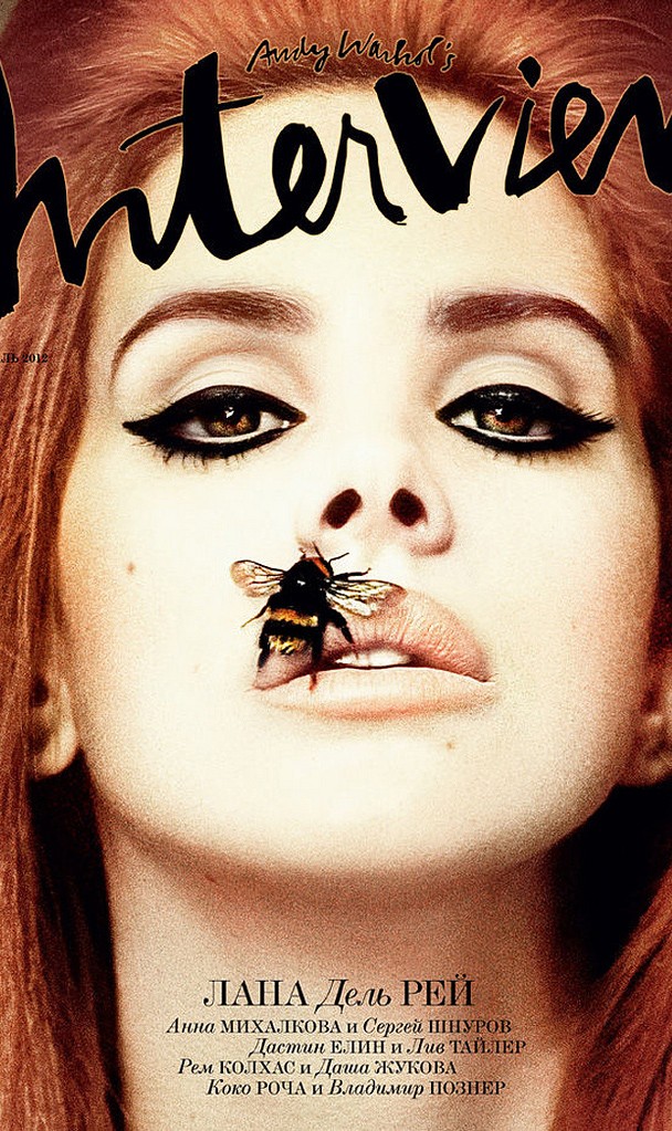
      This first magazine features a close up image of Lana Del Ray that takes up the entire page; there is minimal text on the page which makes the magazine cover look professional although this is typical of a fashion magazine rather than music magazines. Lana Del Ray is an artist and performer however this information is not obvious from the front cover. I dislike close up camera angles for music magazines as they are deceiving but also not necessary, usually people are fans of musicians and bands because of their songs and their style, not necessarily solely their appearance.


      These 5 magazine covers all feature mid-shots of one person; the mid-shot is the most commonly used camera angle for front covers of magazines as it stands out the most as well as allowing enough space for text. Every magazine has very distinctive colour schemes, the Azealia Banks 'The Hundreds' magazine (top right) includes white, red, and darker tones including black, brown, and purple; and the Taylor Momsen 'Page Six' magazine is very neutral including grey, white, black and pale skin tones. It is important for a magazine colour to have a smaller range of colours as it looks more professional and neat. 
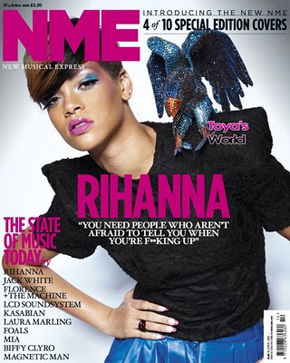
      The NME magazine featuring Rihanna looks completely different to any regular NME magazine featuring any indie/alternative artists. As Rihanna comes under the Hip-Hop and R&B style of music, typical NME fans would not expect her to be featured on the cover; the usual NME logo is black, white, and red. The original page format has been transformed into what now looks like an R&B/Pop magazine, with a colour scheme of bight blue, bright pink, black, and white.


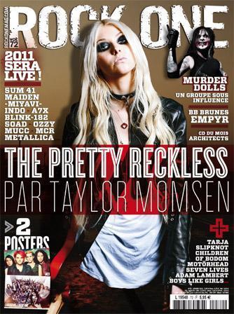
      These three are all moderately long-shot magazine covers; ELLE is a fashion magazine featuring Alexa Chung (model); Rock One is a music magazine featuring Taylor Momsen (The Pretty Reckless - band); and Esquire is a Men's magazine featuring Blake Lively (actress).
      The ELLE magazine is quite clearly a fashion magazine by just looking at the front cover, this is the subscribers edition however so it has less text and advertising on the front page than the general copy. I will try to stay as far away from creating a fashion style magazine as I can to ensure that it is clear that my magazine is of the music genre. 
      Rock One is a music magazine featuring mainly rock bands, but it also includes reviews and images from other genres of music as well. Judging from the cover page it looks like a very gothic magazine, this is due to the dark colour scheme and background, as well as the eroded font title. I feel that there is too much going on on this front cover; there should either be one main image surrounded by text only; or one main image with small amounts of text and a few smaller images. On this front cover the text and smaller images all combine to be over the top, however this could have been designed to appear dramatic and overcrowded.
      In my opinion Esquire also looks as though it could be a music magazine from the front cover alone. The colour scheme is simple and the font used on the cover can appeal to all audiences as it looks as though it is hand written. The cover appears as a small version of the contents page as it includes page numbers with titles of pages as well as slogans such as 'you have to read this' and quotes from the pages themselves.