Tuesday 31 January 2012

Moodboard


This moodboard I have created shows a range of images that inspire me to think of designs for my magazine. Some of the images are of musicians/artists themselves, and other images are taken from ffffound.com and LookBook. The images I have chosen all reflect the indie/alternative genre; this genre does not have to be based solely around music but can also be a genre of imagery, film, or fashion. 
The artists I have featured on this page are, Azealia Banks, Lana Del Rey, and Crystal Castles. These artists are not necessarily within the musical indie genre, but their style in the images I have selected represent an alternative 'look'. This 'look' is continued through to the LookBook images I have chosen, four of which are of girls and one of a boy; although I am certain that the artist I feature in my magazine will be a female solo artist I have also looked at boys fashion. 
There are two images showing examples of fonts on my moodboard, each image contrasts the other as one is plain black and white bold text; whereas the other uses more fancy fonts. I prefer the plain black and white text as it stands out more on the page, making it easier to read for the consumer.

Saturday 28 January 2012

About my Magazine

My music magazine will be based on the indie/rock genre; my audience will be typically between the ages of 15 and 30. The music I have chosen to feature in my magazine will be similar to: The Maccabees, Little Comets, Two Door Cinema Club; with a contrast of more grunge/rock style bands such as Nirvana, Joy Division, The Libertines.

My plan is to base my article around a band splitting up and one of the members going solo; the front cover will feature the solo artist alone but the article will include images of the former band all together as well as screen shots from their one hit wonder music video.

Sunday 15 January 2012

Inspiration: Wired & Philadelphia

Philadelphia:


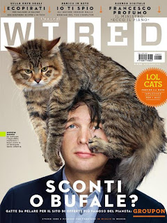
Wired:


These two covers both feature males, however I am ignoring this factor to take inspiration from these covers. Both of the photographs are mid to close-up shots, I like the way Wired has been positioned, and the abstract 'look' of there being a cat on his head makes the magazine look quirky and attractive to a younger audience. The Philadelphia magazine cover has the same effect although instead of using an animal, he has a moustache drawn onto his finger. The use of the moustache contrasts the age that the man in the photograph appears to be, this appeals to the young audience, similar to the photograph of the man; as well as a more mature audience, through the symbol of the moustache.

Friday 13 January 2012

Inspiration: LA


This LA magazine has a very basic front cover, however I like the idea of sticking to three colours within the colour scheme. The main feature of this magazine is Lily Collins, the photograph of her is very disconnected from the reader's eye which makes the magazine more appealing in some ways. I like the fact that the photograph is not over styled, she is wearing a simple satin shirt with natural make-up on; I would like to have a similar effect on my front cover with simple clothing and natural make-up.

Thursday 12 January 2012

Inspiration: Complex magazine

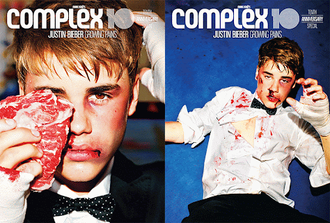
Justin Bieber:


Nicki Minaj:


These two Complex magazine covers inspire me as they both have mid-shot style photographs for the front cover; also on the Nicki Minaj edition in particular she is pulling a funny facial expression which is how I would like the artist to look on my front cover. The text on these front covers is too basic for the audience that I am trying to attract; also the two artists used in these examples are world famous and everyone knows who they are so they would buy the magazine just for the featured person. This approach would not work with the feature of my magazine as it is about Georgia going solo from her former band, so not many people would have heard about her solo career as of yet.