I have looked at one of my peers' contents pages, Katie Ford (also used in my audience profile), I particularly like her style of contents page and will try to create my own version of this.
Katie looked at a magazine cover of Oz magazine:

This is one of the very few magazine pages I have seen with this layout in thirds; the text all crammed in at the bottom looks extremely effective. I dislike the use of colour on this page, however it is the front cover of a magazine so it would most likely be in colour anyway.
I have also found a few more contents from R.A.D magazine:
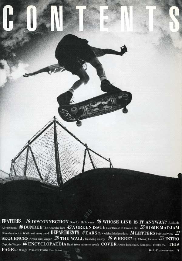
November 1989:
December 1989:
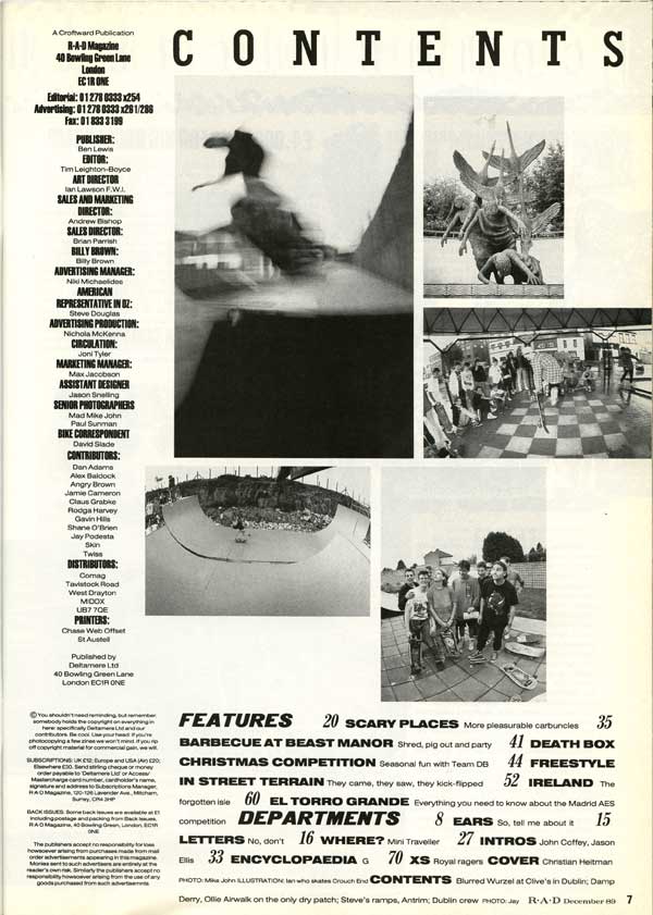
Both of these R.A.D contents pages use the 'Features' section in the bottom third of the page; the December issue has writing down the left hand side as well although I don't think this looks as professional and effective. The November issue contents page is exceptionally similar to Katie's design, but with different words and a photograph taken by herself. I will take into consideration the use of a black and white image; which is also found through Ansel Adams' photography work.
No comments:
Post a Comment