Wednesday, 28 March 2012
2. How does your media product represent particular social groups?

 My magazine is aimed at the target audience
of mixed genders, aged between 16 and 35. This outline is a basic target
audience and people from outside this target audience may also read my
magazine, although they would not be counted in the general age range. The
genre of my music magazine is indie-alternative-rock-pop, the genre sounds
complex and varied, however it is not; most people of the ages 16-35 listen to
some form of music within this genre however if someone is an R&B or Rap
music fan, this would not be suited to their taste. I would like to think that
readers of my magazine would not necessarily be the same personality-wise; my
magazine can welcome a broad range of personalities all with a similar music
taste in common.
My magazine is aimed at the target audience
of mixed genders, aged between 16 and 35. This outline is a basic target
audience and people from outside this target audience may also read my
magazine, although they would not be counted in the general age range. The
genre of my music magazine is indie-alternative-rock-pop, the genre sounds
complex and varied, however it is not; most people of the ages 16-35 listen to
some form of music within this genre however if someone is an R&B or Rap
music fan, this would not be suited to their taste. I would like to think that
readers of my magazine would not necessarily be the same personality-wise; my
magazine can welcome a broad range of personalities all with a similar music
taste in common. There is no particular ‘indie-alternative-rock-pop’ style of clothing; therefore my magazine does not represent a specific social group such as punk, or hip-hop. There is no defined fashion to the genre of music that I have chosen as people can create fashion from whatever they want; people claim that there is an ‘indie’ fashion however ‘indie’ just means individual, which means that everyone can interpret their clothes, music, interests, in their own way.


There is nothing particularly ‘alternative’
about the way my front cover is presented; for example, if it was to appeal to
a gothic social group there may be a darker colour scheme used and more
dramatic hair, make-up, and clothing in the photograph.

My contents page however does have more of a quirky, unpredictable layout
compared to the structured front cover; I chose to recreate the design of R.A.D
magazine because I thought it was a particularly eye-catching way of presenting
the contents of the magazine. The main feature of the page is of a photograph
of a New York skyline from the Hudson River. However this does not represent my
indie-alternative genre, as New York City is an extremely famous tourist city;
although some would say it’s individual as there is nowhere else like it on the
planet.

My double page spread is a simple
constructed layout, and there is nothing particularly alternative about it in
any way. I have followed typical magazine conventions by using 3 columns of
text on each page; having quotes among the article in a bigger font;
introducing the article with a short preamble.
3. What kind of media institution might distribute your media product and why?
Distribution of magazines is restricted to
mainly magazine stands, websites, and posting magazines to subscribers.
However, some magazines are advertised on billboards and on television, which
also brings about a wider audience; this is something that IPC Media have
achieved as there are successful Now magazine advertisements on television, and
some magazines appearing on billboards. Having an online magazine can attract
more young people as they spend a lot of time on the Internet and on computers
in general in the UK; this could make my magazine appeal to youths more, which
is a main section of my target audience. Paid circulation would be how I would
choose to distribute my magazine; the general public does not tend to pick up
free magazines so the features of my magazine would be pointless. My magazine
would also feature top stories and breaking news related to popular alternative
artists. NME is available for subscription, as are multiple other magazines; I
would choose to have this option available for readers of my magazine as
subscriptions are well worth the money, and can include freebies and other
privileges.
4. Who would be the audience for your media product?

As I previously said, my audience can be of
a wide range of people, Katie is just one of the typical people to be attracted
to my music magazine. Katie is a student currently studying A-levels so when
she has free time she is always interested in reading and listening to music.
Other people who could read my magazine are those studying at university, and
young people without children who have spare time for reading. I would expect
the audience of my magazine to be in touch with music at the time that the magazine
is released every month; this is only so that they can fully appreciate the
acts included in each edition.
5. How did you attract or address your audience?
My audience can be attracted in any way in
which they interpret my magazine; I have not particularly styled the front
cover to be attracted to anyone in particular as I have used a combination of
styles on this page alone.
Image used for front cover:

The photograph is of Georgia’s face, however she is
pulling a funny facial expression which could appeal more to a younger audience
as it suggests that she has a fun, outgoing character. The title of my magazine
is very bold and simple to read, this shows that there is a level of
sophistication within my magazine and that it is not just appealing to
students. To contrast the bold, simple, title I chose to have a scribbled or
handwritten font for the features of the magazine on the font cover. The
scribbled effect can either look childish and messy, or can look organized in a
playful way; by using a combination of fonts I have attracted both students and
young adults. My front cover has a very simple colour scheme, black, white, and
red; this is so that my magazine cannot be confused with a ‘teen-pop’ magazine.
The types of magazines that are ‘teen-pop’ are often filled with multi-coloured
images and text, which is the opposite of how I have presented my magazine
cover.
My contents page is also organized in a
quirky way, I have chosen to have text at the top and bottom of the page and a
large photography filling up the entire background of the page. This comes
across instantly as creative and fun for students to look at, however the
photograph I have chosen is very scenic and bland so that the contents page is
still accessible and makes it easy to navigate the magazine.
The language I have used in my article on
the double page spread is legible and written moderately formally. The layout
of my article is an interview between FUGUE and Georgia; this is clearly shown
by having colour coded ‘F:’ and ‘G:’ which shows that my article is clearly
labeled and easy to follow. The way in which I have interpreted Georgia’s
interview answers is to make the language and structure of sentences easy for
people of all ages to understand.
6. What have you learnt about technologies from the process of constructing this product?


My skills with Adobe Photoshop CS5 have
improved greatly by producing my magazine. I already knew how to work the
program due to having it on my laptop at home; however I had to organize a
large number of layers for my front cover and double page spread pages as there
is a lot of content to them.
My photography skills have progressed in
terms of editing and lighting; I used a Canon 1000D SLR camera to take the
photographs for my magazine, which was helpful as it is a high quality camera.
I edited the photos of Georgia so that the lighting was altered, and the
contrast balance appeared more realistic.
I also used Flickr to upload my photographs
of Georgia onto; this meant that I could show a wider audience my photography
for my magazine. I also used Slideshare and Animoto, which are both websites
that I am unfamiliar with, so I have now broadened my use of websites to
present my work on for future reference.
7. Looking back at your preliminary task, what do you feel you have learnt in the progression from it to your final product?
From the start of this coursework to the
end my skills have developed well, I feel that my product even since my draft
magazines has improved. I have stuck with a similar design all the way through
for my front cover and double page spread; however I changed my contents page
dramatically. I failed to achieve the design that I had planned for my contents
page so I did some more research in contents pages and looked at one of my
peers’ contents pages which is where I took my inspiration from.
Tuesday, 27 March 2012
Wednesday, 21 March 2012
Tuesday, 20 March 2012

Publisher

A publisher that I would consider using for my magazine is IPC Media; they publish many other magazines of different types so this publisher could cause my magazine to appeal to a wider audience. IPC Media produces over 60 famous products, most of which are of a broad range of magazines. For example, Now, Look, Country Life, Nuts, TV Times, and NME magazine. NME magazine are a very similar magazine to mine in terms of genre.
NME magazine looks completely different to my magazine visually, which is why I think there is a gap in IPC Media suitable for FUGUE magazine. IPC as a company has been around since the 1800s, this means it is a successful large company and my magazine would be publicised well. NME magazine started to be published by IPC in the 1990's and is now an extremely famous music magazine.
Contents: Photo

This is the image that I have chosen to use for my contents page; I took a trip to New York with my family over the half term and managed to take some clear photographs on my holiday. This image stands out however as it was an extremely foggy day. The view is from the Hudson River, and looks over onto a small section of the city.
I will be able to use a black or grey font for the title of this page, as well as either white or black writing for the main text at the bottom of the page; I would prefer to use white but it depends if it is legible enough on the grey water.
Monday, 19 March 2012
Contents: Design Idea
I have looked at one of my peers' contents pages, Katie Ford (also used in my audience profile), I particularly like her style of contents page and will try to create my own version of this.
Katie looked at a magazine cover of Oz magazine:

This is one of the very few magazine pages I have seen with this layout in thirds; the text all crammed in at the bottom looks extremely effective. I dislike the use of colour on this page, however it is the front cover of a magazine so it would most likely be in colour anyway.
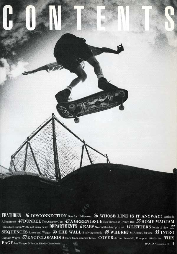
I have also found a few more contents from R.A.D magazine:
November 1989:
December 1989:
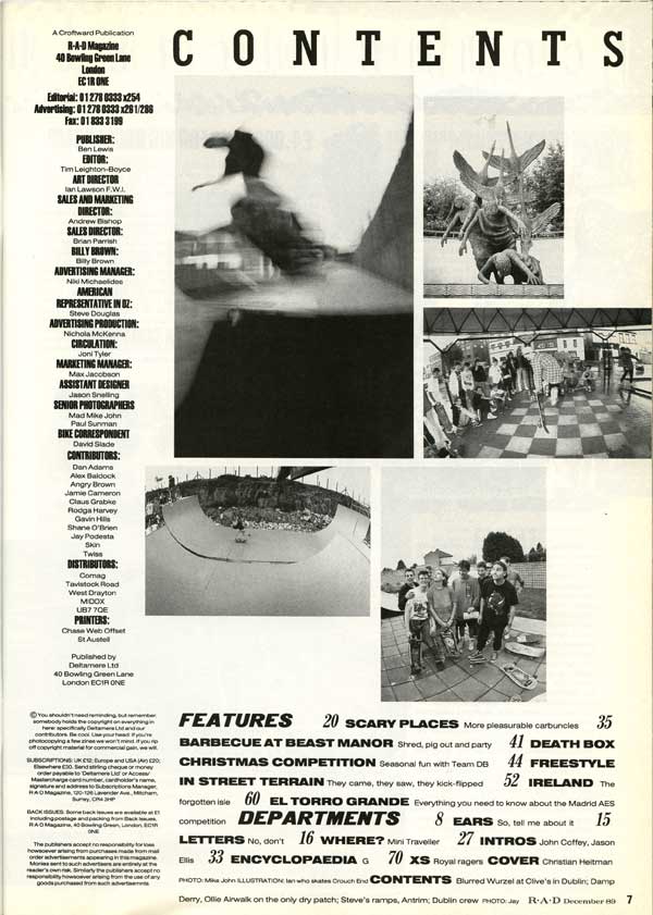
Both of these R.A.D contents pages use the 'Features' section in the bottom third of the page; the December issue has writing down the left hand side as well although I don't think this looks as professional and effective. The November issue contents page is exceptionally similar to Katie's design, but with different words and a photograph taken by herself. I will take into consideration the use of a black and white image; which is also found through Ansel Adams' photography work.
More Photos:
1. 
2. 

3. 

4. 

5. 

6. 

7. 

8. 

I have now included more 'urban' style photographs; this style of image will tie in more with the harsh use of black and white on my other pages. I would most likely make the chosen image greyscale when using it on my contents page so that it looks more effective with black or white writing over the top of it.
Photos:
1. 

2. 

3. 

4. 

5. 

6. 

7. 

8. 

9. 

10.

11.

Here are 11 photos that I have selected from my own photography; one of these photos will hopefully be the final image that I use on my contents page. I may have to look further through my files if none of these pictures are suitable.
Ansel Adams
I have looked at the work of Ansel Adams to influence my choice of photograph for the background of my contents page. Here are some photographs that he has taken that particularly appeal to me:

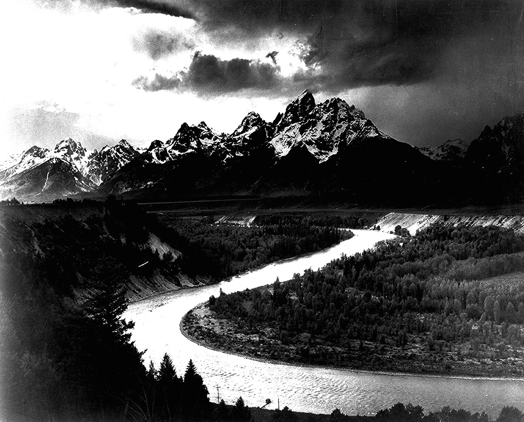


His images are mainly in black and white, this could work effectively as a background image as it will tone in with the font colours I will use: black and white.
Some of my photographs are very similar to Ansel Adams, so I have edited them to make them black and white to try and fit in with his theme of work.
Subscribe to:
Comments (Atom)