Philadelphia:
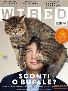
Wired:
These two covers both feature males, however I am ignoring this factor to take inspiration from these covers. Both of the photographs are mid to close-up shots, I like the way Wired has been positioned, and the abstract 'look' of there being a cat on his head makes the magazine look quirky and attractive to a younger audience. The Philadelphia magazine cover has the same effect although instead of using an animal, he has a moustache drawn onto his finger. The use of the moustache contrasts the age that the man in the photograph appears to be, this appeals to the young audience, similar to the photograph of the man; as well as a more mature audience, through the symbol of the moustache.


No comments:
Post a Comment